tracer le passé pour éclairer l'avenirEditorial Design ✧ Diploma Thesis
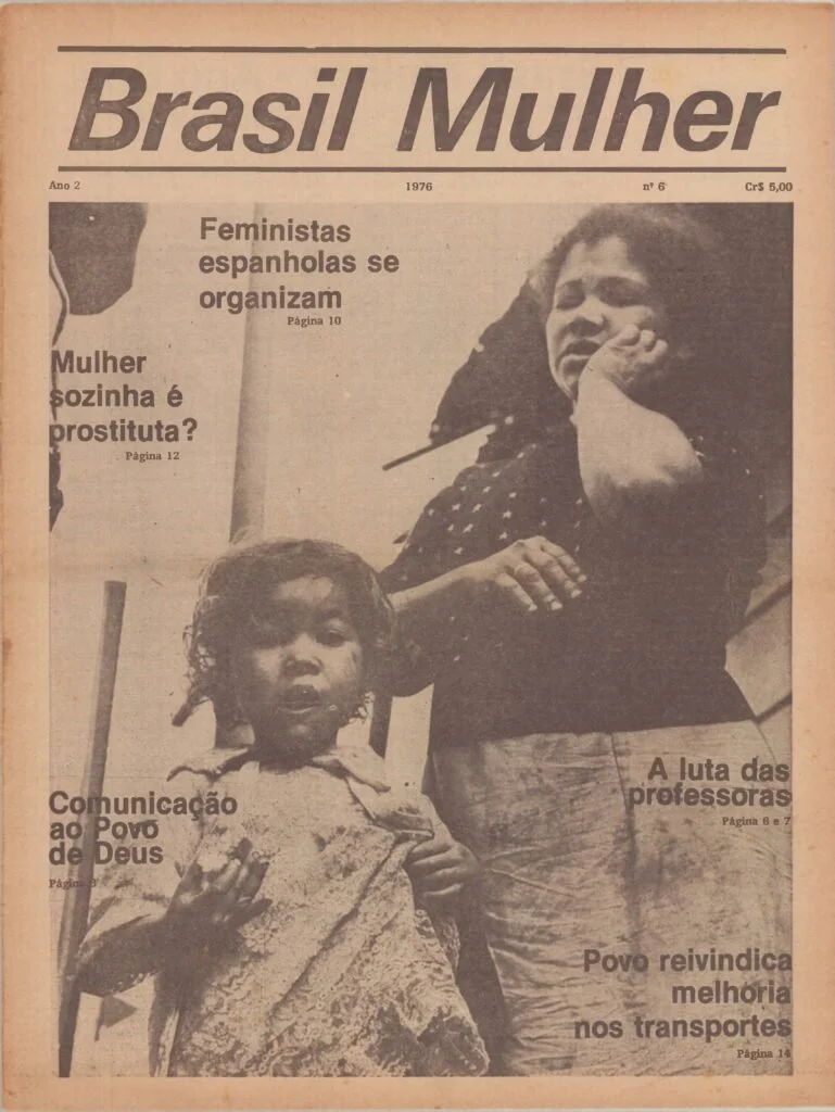
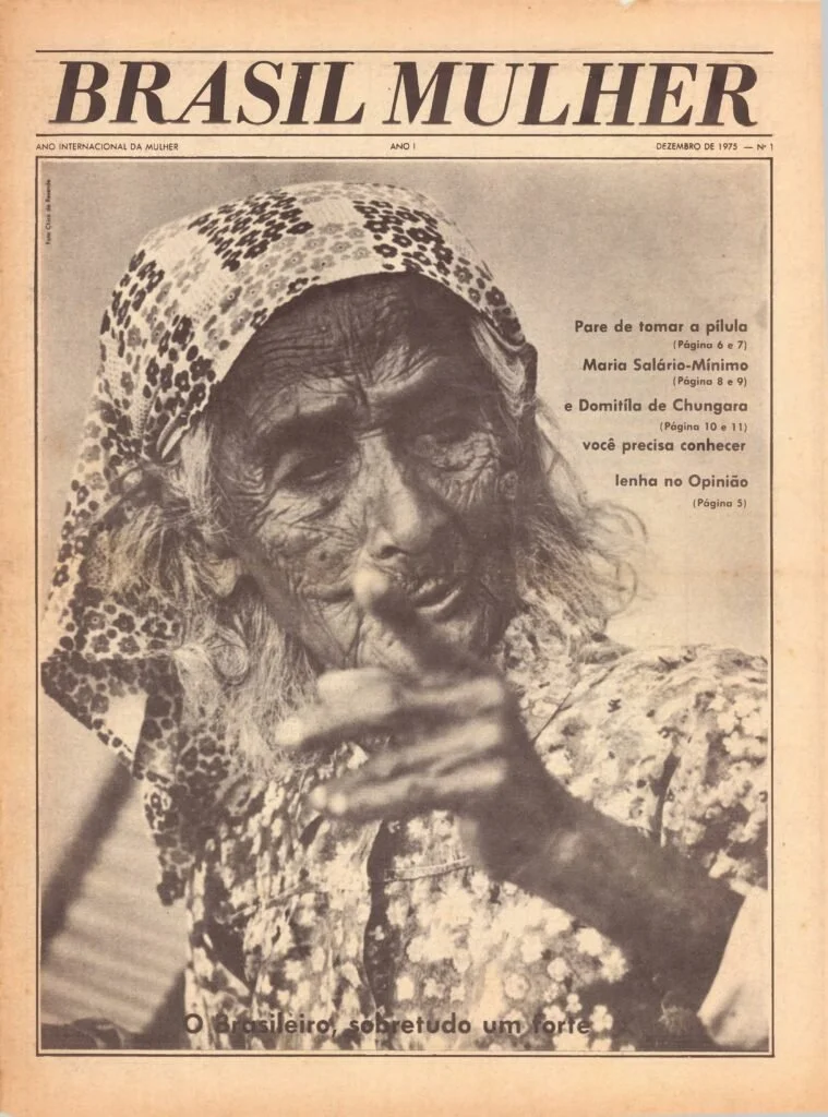
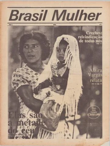
Feminist periodicals in the 1970s were part of what was known as the "small press" or alternative press, often carrying an ironic connotation: journals filled with collections of reflections and debates that rejected outdated sexist ideologies. Brasil Mulher particularly inspired me, especially with the simple yet impactful layout of their covers.
References ✳ Archives
I noticed that magazine, newspaper, and journal archives also served as references for layout design...
Have you ever lost hope while fighting for a cause and not seeing any real progress?
In 2019, Bolsonaro is elected, and I leave Brazil. In 2020, Bolsonaro pays tribute to Ustra, the greatest torturer in Brazil's history. I am afraid. I lose hope. Yet creative design is the tool of my commitments.
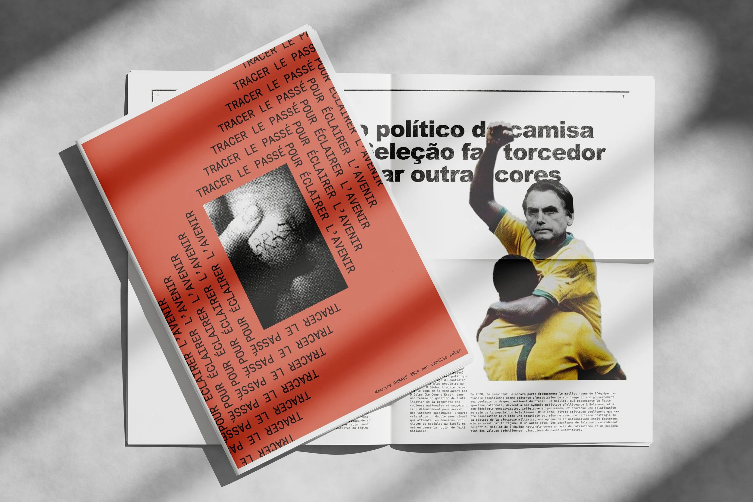
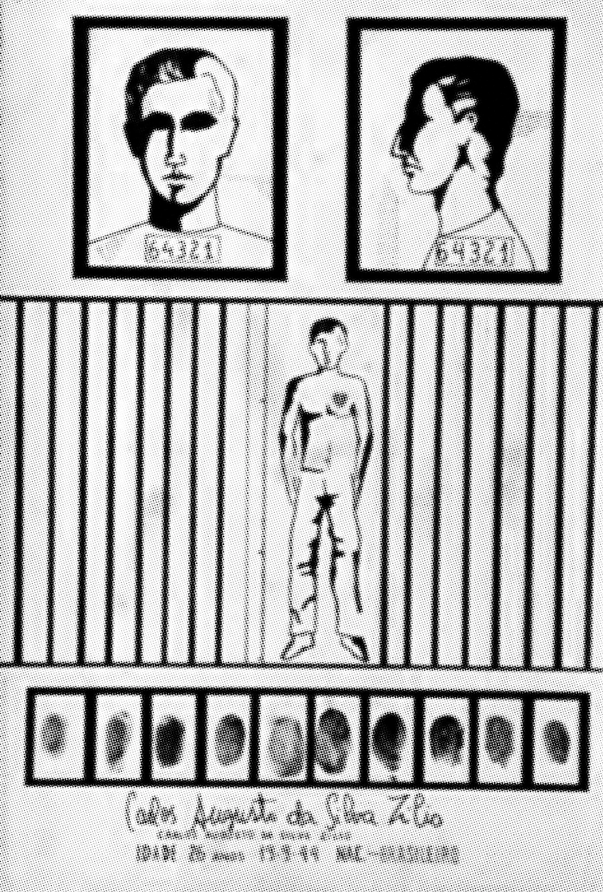
As part of the DNMADE Graphic Design diploma, I took the opportunity to write an article exploring how graphic design can raise awareness of times of terror, based on real records and archives from the dictatorship in Brazil (1964-1985). The title translates from French ❝ Tracing the Past to Illuminate the Future❞.
September to December, 2023
Research ✳ Feminist periodicals
References ✳ Inspiration & Brainstorming
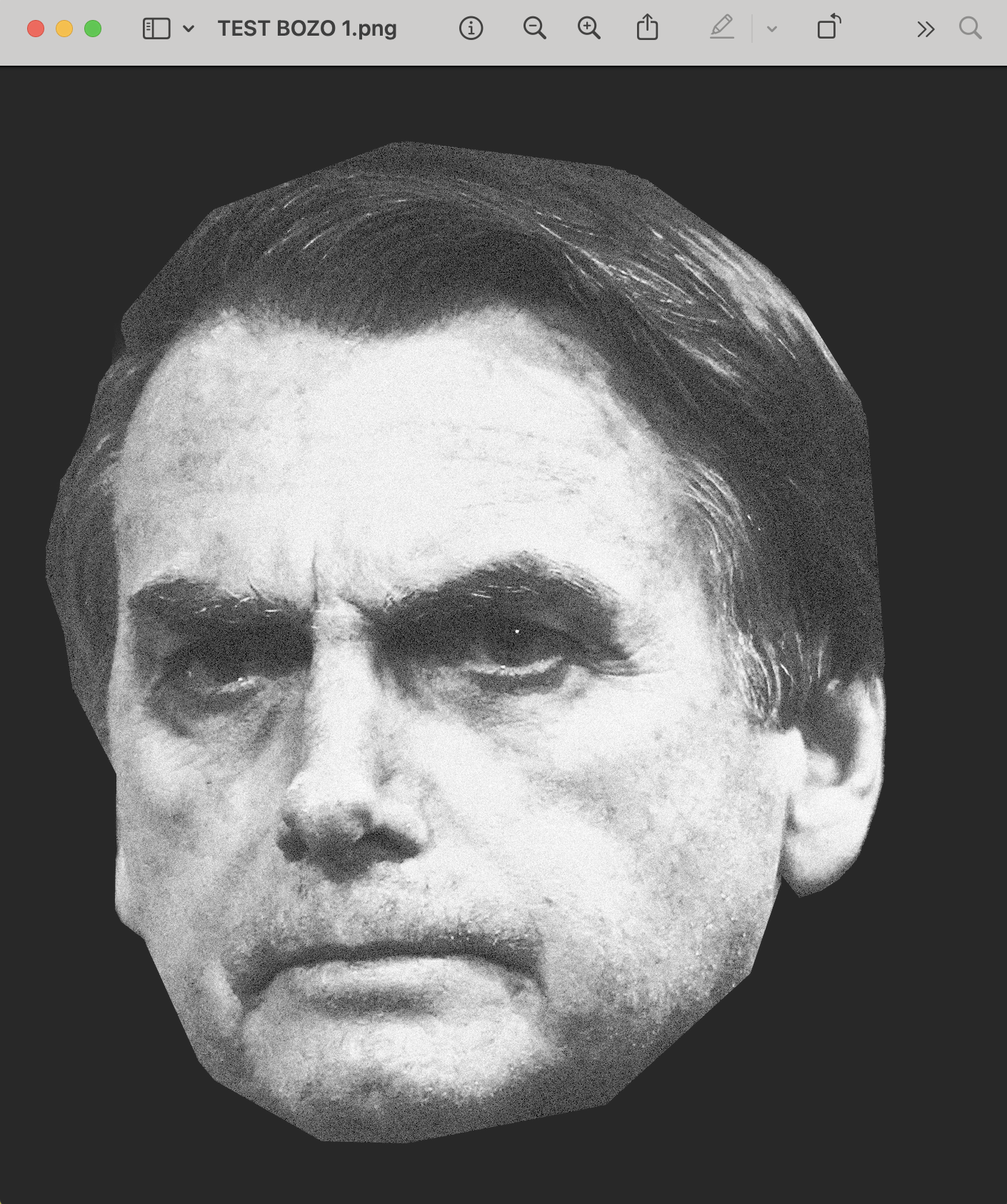
Graphism ✳ Image processing
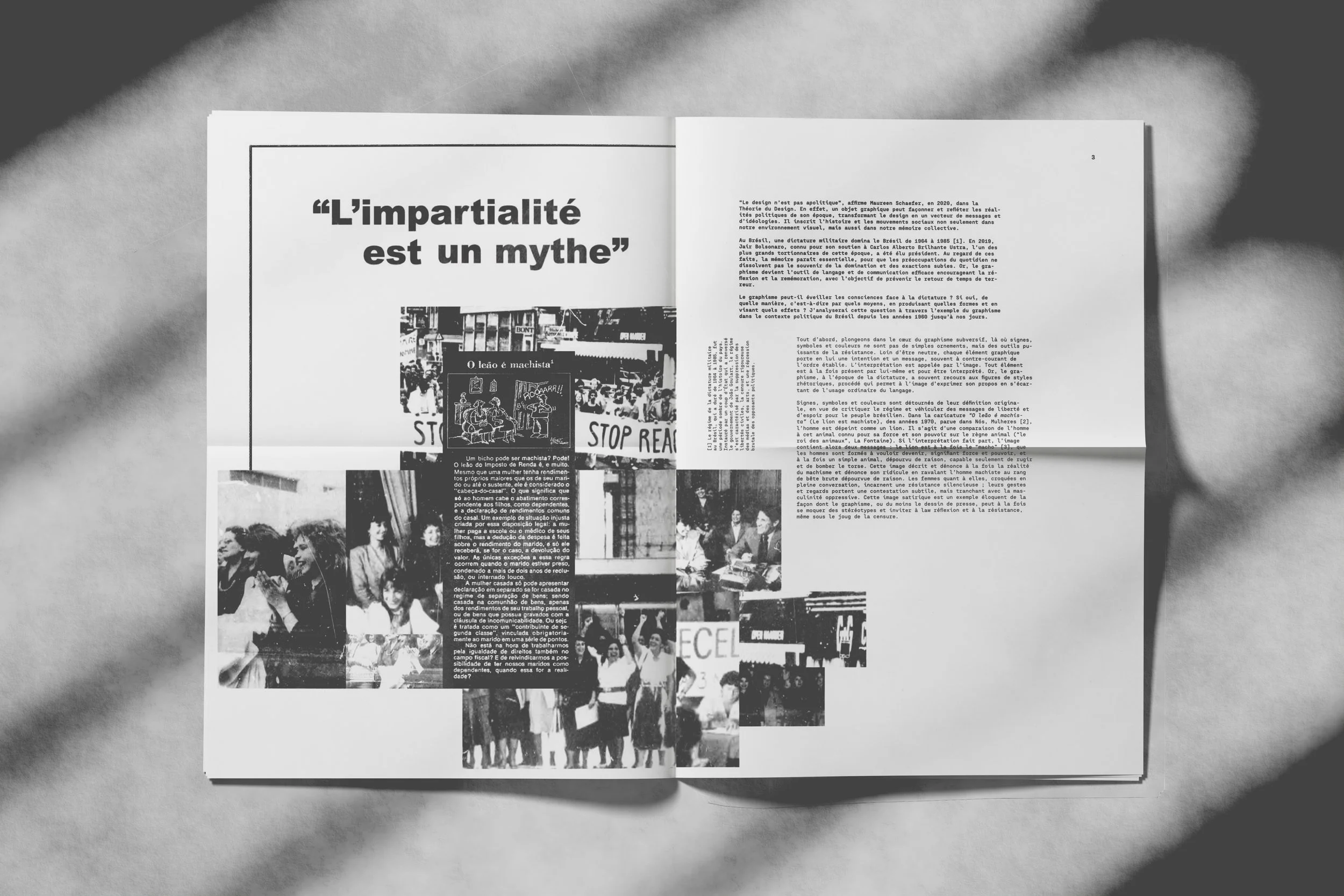
Mediation ✳ Final Edition
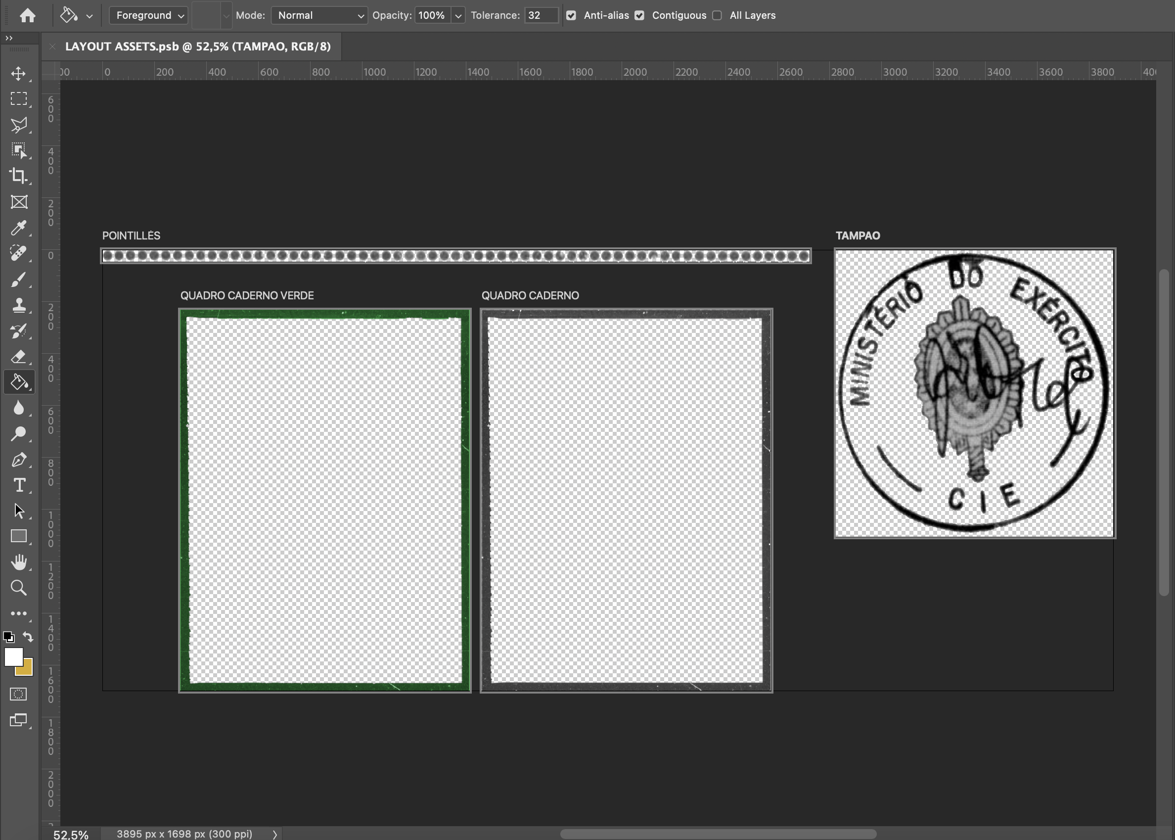
Editorial Design ✳ Construction of Graphic Elements
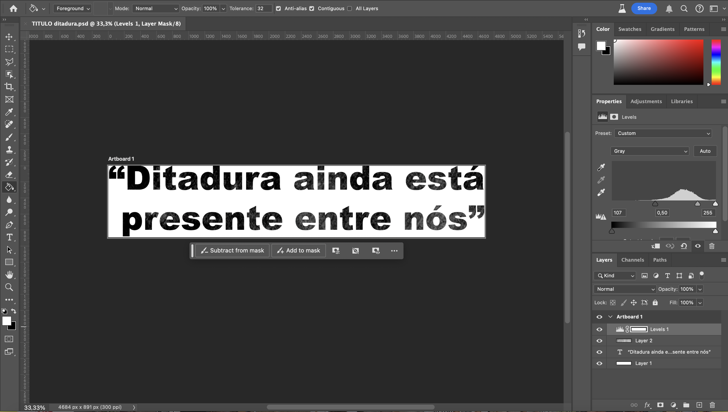
Graphism ✳ Titles
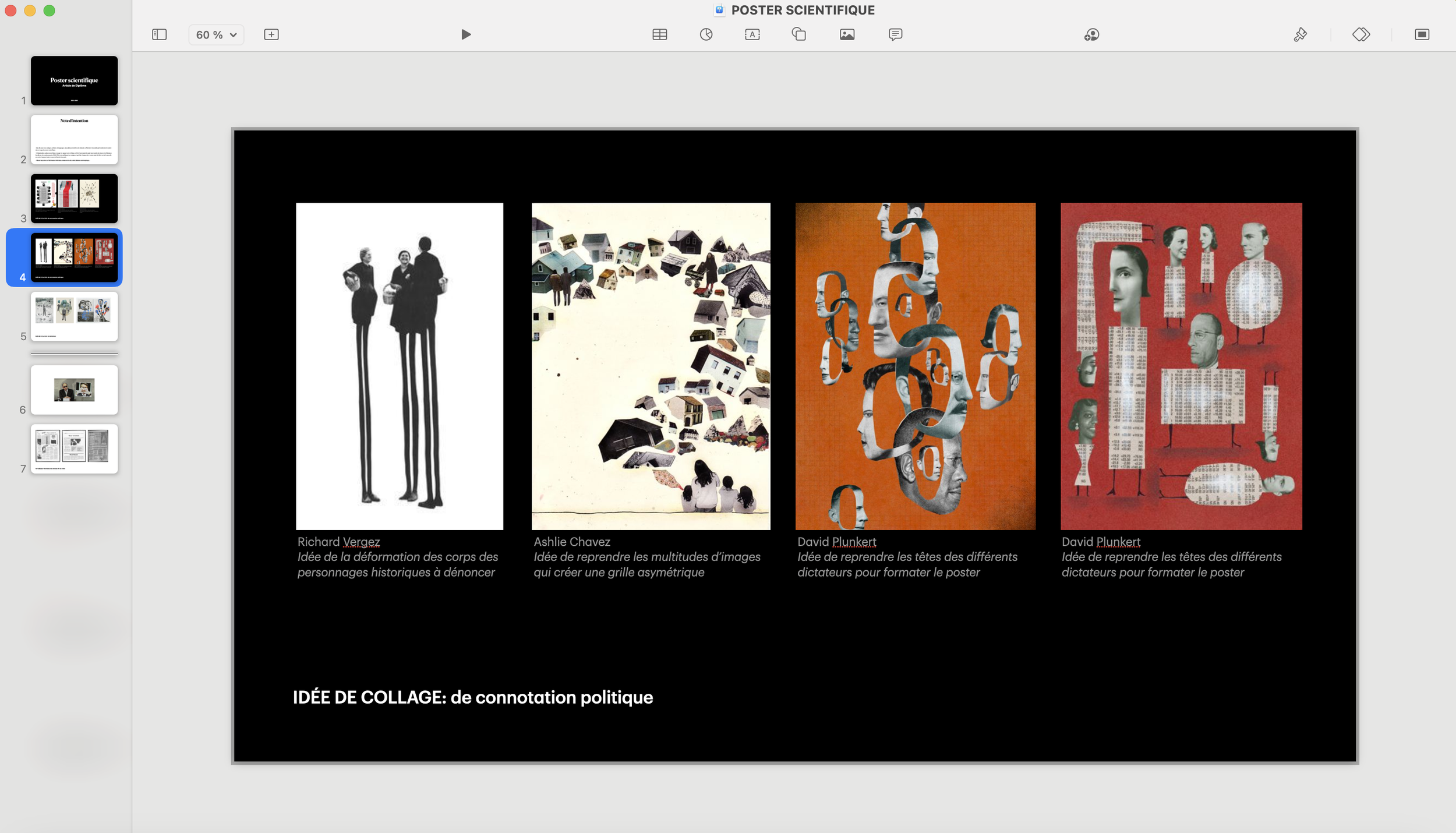
Creating a folder that brings together both inspirations and ideas is an essential step for me when developing a project. For this particular project, I draw inspiration from David Plunkert, for his ability to visually represent stylistic devices such as irony, and from Neville Brody, particularly his work for The Face magazine, where he employs unconventional grid structures.
Mediation ✳ Final Edition
⤵⤵